Koppert Cress launches new, colourful packaging line
Category: Sustainability
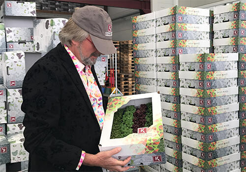
After years of using the same packaging, we felt it was time for something new.
After years of using the same packaging, we felt it was time for something new. The design needed freshening up and the new, compulsory certifications needed to be added. The final result is easily recognizable, distinctive, more manageable, and has a direct link with flavour and application. From 20 March 2017, all products will be supplied in the completely restyled contemporary design.
Better packaging and better protection!
The distinctions between the different packaging variants lie in the colour combinations. The starting point is the five flavours. Each product has its own colour palette, supplemented with images of taste associations or flavour companions. The box has gained a lid, the smaller-sized packs have been revamped, and the Top Seal and film packaging have been replaced with a transparent tray with a paper strip around it.
Dutch Cuisine approach emphasized in all languages
Special attention is devoted to Dutch Cuisine, the recently-emerged trend in gastronomy, based on five principles: culture, nature, health, quality, and value. The principle of 80% vegetables and 20% meat or fish forms the starting point that Koppert Cress fully subscribes to and that Rob Baan expresses in his goal to make the Netherlands the healthiest delta in the world. Dutch Cuisine embodies the typical food and drink of the Netherlands, something that is unique in the world and which we are proud of as a country. Always based on the principle of ‘less is more,’ Dutch Cuisine is about harnessing our own creativity, ingenuity, open-mindedness, and pragmatism to cook delicious, healthy, and responsible food. Alongside this, we support the five principles for human and environmental sustainability that guide us in our day-to-day activities. More about Dutch Cuisine-> LINK.
More attractive contemporary presentation
A unique and tongue-in-cheek way to indicate the temperature required by the cresses ;)
What is the story behind the colour profiles?
In order to avoid making the different boxes all green, we have made distinctions. We are therefore introducing the new packaging with a flavour palette to help the chef/cook looking for one of the basic flavours: acidic (green), sweet (pink), salty (blue), bitter (brown/yellow), or umami (orange). For every type of cress or speciality, we know the basic flavour that fits into a category, and the corresponding basic colour will therefore feature prominently.
Besides the colour coding, the boxes also show a number of flavour companions (associations in application/combination, colour, flavour, and feel). For instance, the acidic Vene Cress has associations with beetroot, lime/lemon, and rhubarb, and combines extremely well with red fruit.
Such associations will result in a further development of the colour spectrum and a further distinction between the boxes.
Related articles
Also interesting